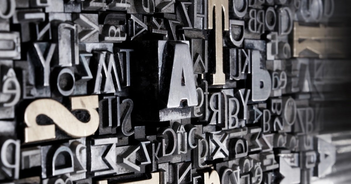
When creating a website, you’re met with a bunch of fonts to choose from. Ranging from easy-to-read fonts to some rather fancy styles, the possibilities are truly endless.
The font you choose will typically depend on the design you’ve angled your site towards. Nevertheless, some experts say they’re fonts that can be crawled easier by search engines.
They call these SEO-friendly fonts and because search engines commonly crawl websites with simple text, they can quickly identify the page’s layout. Here they can uncover the headings and paragraphs. But it got me thinking, should titles of websites be italicized? Will this boost my overall SEO?
Whether your titles are italicized or not shouldn’t cause any negative or positive effects on your overall SEO score. However, experts say there are fonts in which search engine crawlers can read better than others. These are Arial, Time New Roman, Helvetica, Times, Courier New, and Verdana. By using these fonts naturally in your titles may increase the chances of ranking or rank quicker.
Remember that these SEO advantages will only be relatively small and won’t affect your website’s ranking massively. These are just industry recommendations, as these are easy to read and are commonly used on many websites.
In this article, we’re going to dive deeper into detail about selecting a website font that can increase SEO, view time, and much more.

How to Choose Fonts for Your Website
If making a website isn’t hard enough with the millions of elements you must think about, such as the graphic design, layout, branding, imagery, and much more, font is another factor you need to consider. The font is easily overlooked as an essential website element, but trust me, it can have a significant impact on your engagement, viewability, and ultimately, rankings.
However, apart from choosing an easy-to-read font, you also want it to look good. Below we go into detail about how you can pick a good readable font that looks excellent with your websites design.
If you want to see some examples of font pairing you can checkout FontJoy
Find A Style That Suits Your Design
First things first, you need to find a font that suits your design layout seamlessly.
It’ll need to represent your branding, its personality, and be easy to read, of course.
Think, is your website aimed towards a traditional type of industry that just requires a basic font, or does it need to be fun and amusing? Personally, if I had to design a website again, I’d conduct some competitive research and see what others within my industry are using.
After compiling this information, I’d then select my favorites and choose from there. However, keep in mind readability, branding, and personality.

Have a Web-Safe and Readable Font
I’ve briefly explained this above, but web-safe fonts are a thing. But what do I mean by this? Well, if you didn’t know already, some fonts that can be applied to your website aren’t installed within all web browsers.
Because of this, the user may encounter issues when trying to load your website. This will cause the user to leave your website right away, which can dramatically decrease your rankings within search engines.
Simple fonts like Arial, Time New Roman, Helvetica, Times, Courier New, and Verdana are installed on every browser, so there shouldn’t be any issues displaying the font. Each of the mentioned fonts is easy to read and is widely used within the world of websites, so choosing one of them would undoubtedly be a safe bet.
If you are not sure, go with the default WordPress Fonts if you are using WordPress Check out this article on WordPress Fonts
Use A Variety of Fonts on Your Website
When creating a website, it’s highly possible that you’ll need more than just one font. For instance, you may use a different font to highlight keywords, titles, and standard text. When using more than one font, there are some fundamental rules you need to abide by, these are:
- Never use more than three fonts on your website. This can look messy and may ruin your page’s aesthetic.
- If you’re opting-in for using more than one font, make sure they work together naturally. For inspiration, I recommend you take a look at this blog post about font families.
- Lastly, make each font identify as something. For example, your title will want to stand out, the text needs to be easy to read, and if you’re thinking about using a third to highlight key phrases, it needs to stand out.
Here are some tips on choosing these fonts:
Firstly, you need to select your primary font.
This will be your most notorious one and should be bold for such things as your titles.
I commonly see that businesses tend to use the same font as their logo when deciding on their primary font.
Next is your secondary font, and this is used for body text.
This shouldn’t be hard to decide on as it’s just a font that needs to be easy to read on all devices. Take into consideration how each text will look on mobile, desktop, and tablet. For a list of easy-to-read fonts, click here.
If you want to opt into a third font, this is typically to highlight key phrases.
Usually, it’ll be your body text font, but bold, italics, or both. By doing this, the reader can quickly identify that this specific phrase is vital to the page.
Keep it Consistent Throughout your Website
Something else you need to consider when choosing a font for your website is consistency.
If you pick three fonts, primary, secondary, and another to highlight specific key phrases, write them down and use them appropriately.
I’ve made many websites myself, and especially earlier on in my career, I was tempted to tamper with my fonts depending on the landing pages, blogs, or product descriptions. But it just never looked right. Although it solely looked great on the page, it didn’t suit the rest of the website.
Look at your font like the branding of your website. You wouldn’t change the colors on your website to make certain pages look better as you’d like them to be consistent throughout your website.

Is Proper Formatting Important in Marketing Strategies?
Proper formatting is essential to master marketing strategies. It ensures that your content appears professional and engaging, attracting the attention of potential customers. Well-structured layouts, clear headlines, and concise paragraphs enhance readability, making it easier for the audience to digest your message. By prioritizing proper formatting, you can optimize the effectiveness of your marketing efforts and achieve better results.
Conclusion
After reading this article, you should understand that the titles of your website don’t necessarily have to be italicized.
Don’t get me wrong, it can look nice with some designs, and it’ll be absolutely fine to implement this. However, it doesn’t physically affect the website’s rankings or crawlability from search engines.
We’ve also spoken about fonts and how to select them based on basic fundamentals.
People overlook the ability fonts have on their websites as it can massively impact your SEO. At the end of the day, if users are put off by your font choice they’ll quickly exit the page. From them doing this will negatively impact your rankings.
Remember to check out our post on 101 Social Content tools for Beginners, increase your traffic with these tools.